Overview
Each year the department of Typography and Graphic Communication hosts a graduation show to celebrate the work the graduating students have made during their time on the course. The branding and design of this show is vital, as it sets initial expectations of the show for visitors and reflects the ethos of our course and students. Through developing a strong brand identity, we aim to draw in potential employers for the graduates and create a memorable experience for all attendees.
We began the project by identifying team member’s strengths and areas for development, to ensure we all got the most out of this project whilst producing a strong design. The roles we established were (but not limited to):
Jony Hodgson: Team Leader
Celeste Clift: Social Media manager
Finn Lewis: Lead UX designer
Aaron James: Creative Director
Ben Sturgis: Graphic Designer
Theme
We explored a range of options for the theme of our degree show before settling on ‘Punct’. The basis of our theme is a combination of the Punk design style and the use of punctuation, which reflects the typographic focus of our course. We developed a mission statement to explain our theme, which we used across our assets:
‘Punct is the 2025 BA Graphic Communication degree show — punctuation + punk inspired graphic design. Work on show will demonstrate how specialist typographic skills can be applied to the turbulent world of graphic design, in which we seek to be catalysts for change.’
Research
The research we conducted for this exhibition covered many bases as we wanted to ensure we fully understood the parameters of hosting an exhibition before we began designing.
In the summer the team attended a few design shows to explore how other exhibitions utilised space and wayfinding symbols, as well as getting inspiration from the branding and advertising. These shows included the New Designers London 2024 Exhibition, UWE Bristol graphic design degree show, Curtin University graphic design degree show, as well as full team attendance at the UoR Emergence 2024 degree show.
Following the previous year’s exhibition, we published a survey asking attendees for feedback on their experience of the show. We received useful insights, such as the rooms being too small/cramped. Primarily attendees had a ‘good’ experience (average response score was a 3.5/5 star experience), however they would have liked a more spacious area to better show students work and feel more communal. We attempted to rectify this by reserving extra exhibition space and moving our branding elements into the hallways. This makes the show feel more connected, rather than the branded bar being outside and then the students work all the way in T3 and T4. Whilst students work had to remain in T3/4, we could encourage people to spend time in communal areas and engage with our designs to give the feeling of extra space.
Branding
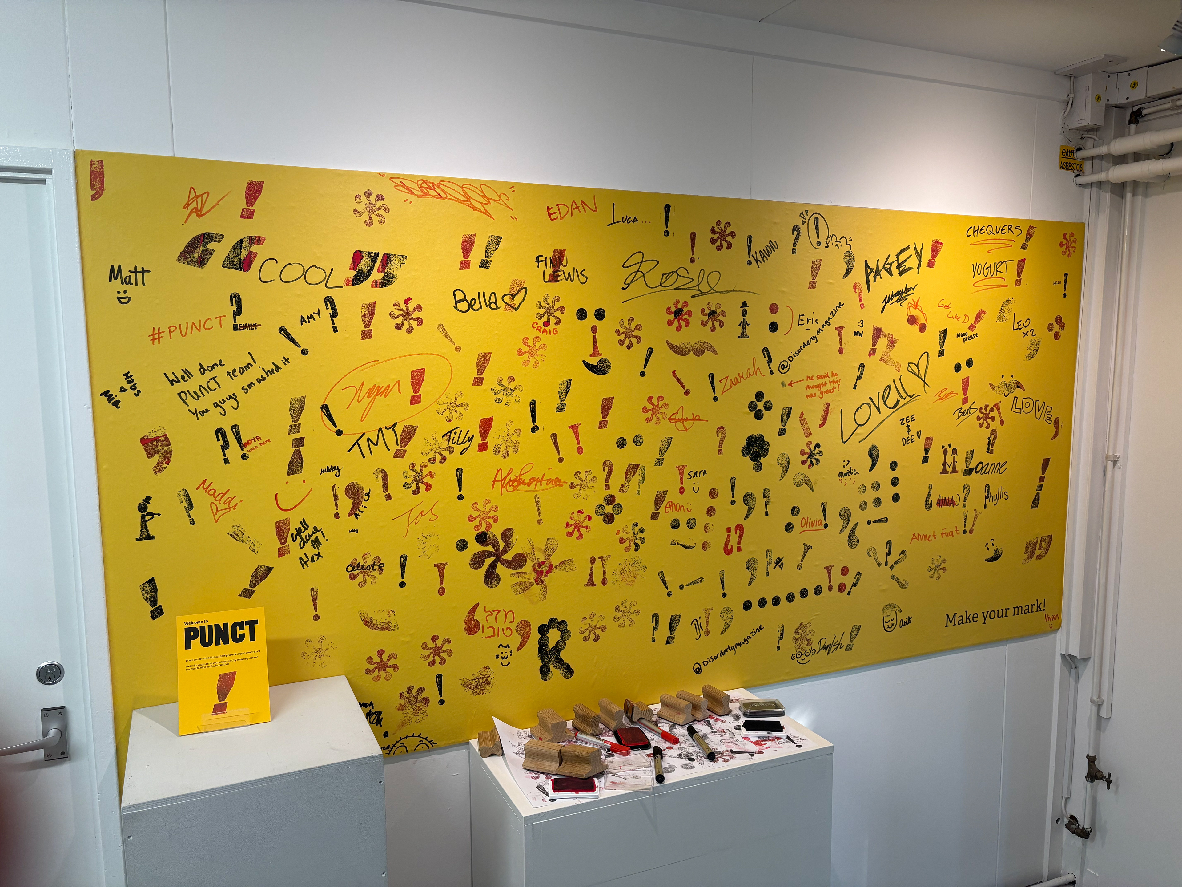
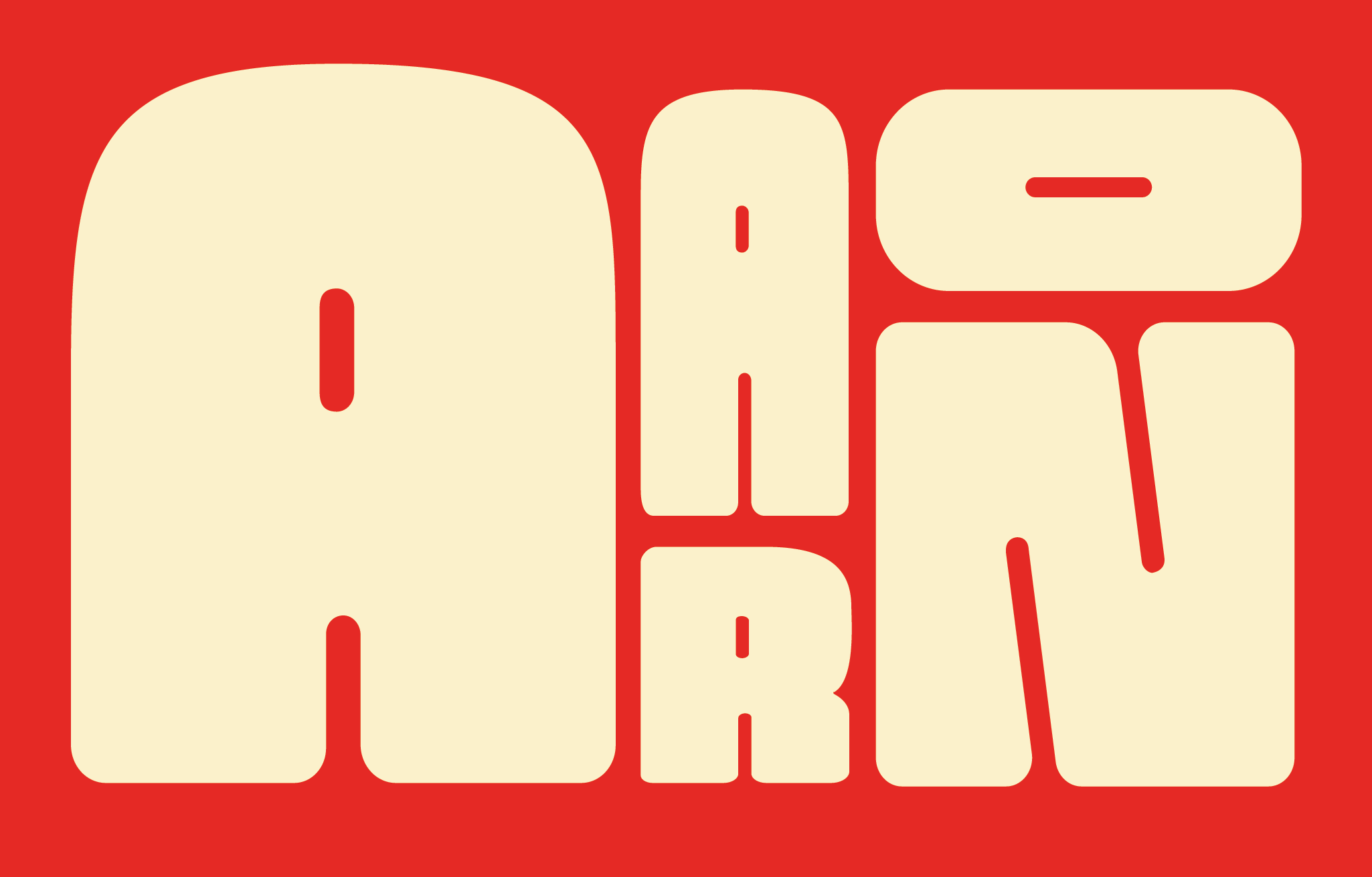
Establishing the brand identity began with a theme and a name for the show. Our idea originated from focusing on micro typography and punctation, celebrating the departments significant contributions on research in the field typography, as well as typography being a key skill of the department’s graduates. Focusing in on punctation, shortened the word to ‘Punct’, a play on words which nods towards punk inspired graphic design.
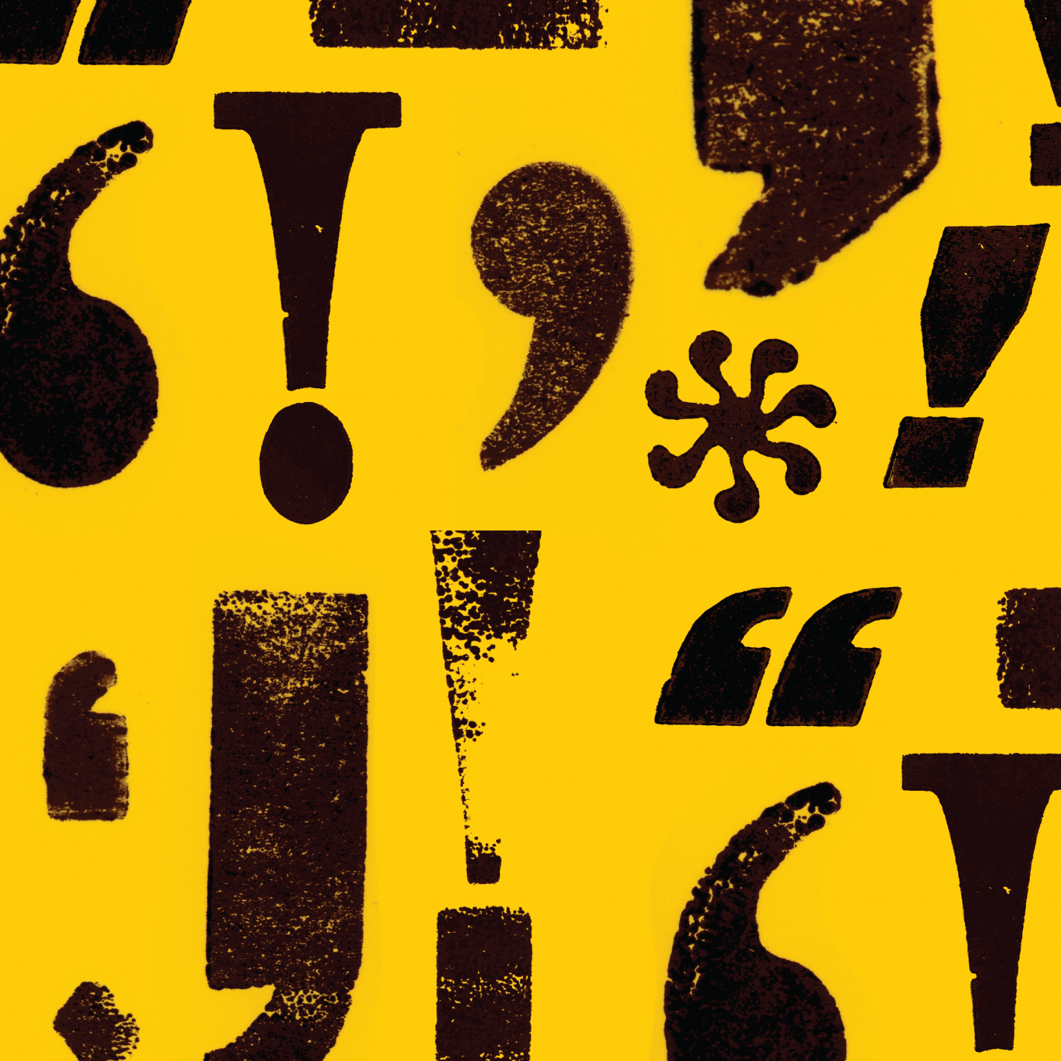
As a visual brand we decided we didn’t want to establish one particular logo, and instead we set out to create a highly impactful and recognisable visual style. This visual style combined scanned in punctation marks from letter pressed wood blocks, and impactful colours. These scanned prints created texture reflective of a grungy punk style, and the punctation marks showcasing the theme of punctation.
Establishing a strong colour scheme was key to creating an impactful and memorable brand identity. We explored many colours, starting with the cliché punk pink and yellow, infamous from the Sex Pistols ‘Nevermind the Bollocks’ album cover, however, while this reflected punk graphic design, it did not feel like our course. Instead, we found yellow, black, and red to be a suitable decision. This restraint colour palette follows the visuals from our research and produced a memorable element to our brand further than the scanned in punctation, contributing to our string brand identity. This colour pallet also balances our theme of punk inspired graphic design with a striking yellow, while maintaining a seriousness and clarity reflective of the work produced by the department.